
Tuesday, November 5, 2013
Yet another bird...
I'm having a great time with these feathery creatures. I just finished up the latest. Here he is all framed and matted. I again, as with the previous birds, struggled with the eye. They are just SO tiny. I am happy with the way it turned out. He looks so knowing.


Saturday, November 2, 2013
Dye workshop
A week ago I taught a color class. I did a thorough walk through of the Color Wheel Company's color wheel. Have you ever read ALL the information it contains? It is a whole lot of good stuff packed into one handy little tool. Every artist, no matter their medium, needs to have a color wheel! We discussed primary, secondary and tertiary colors as well as tint, tone and shade. Also discussed were color harmonies and value. After my students had been totally overwhelmed I sent them home to absorb and rest.
Yesterday I did a follow on class. Using what we learned the previous week and applying it in the dye pot. First we did a simple color wheel, primary and secondary colors only. In doing this we had to decide what primaries we would use. Because we were trying to imitate the Color Wheel Company's color wheel we chose Prochem 351 (bright red), Prochem 119 (sun yellow) and Prochem 490 (brilliant blue). We then had to decide what amounts of yellow to add to red to make orange. It ended up being a 4:1 ratio of yellow to red. With the green we used a 4:1 ratio as well, yellow to blue. For the violet we did a 1:1 ratio. The only secondary that I felt was not quite right was the orange. It needs a tad more yellow. It leans towards the red-orange side. Here's our results in a photo.

They look a lot brighter and truer to color in real life.
We then did some toning of colors using the colors complement. Here we have the mixing of Prochem 808 (raspberry), a red-violet with Prochem 719 (grasshopper), a yellow-green. This is the grouping on the bottom row. In mixing various amounts one gets a beautiful array of complex colors.
The top row is a combination of 228 (saffron), a yellow-orange and 401 (colonial blue), a blue-violet.

| Color Wheel Company colorwheel |
Yesterday I did a follow on class. Using what we learned the previous week and applying it in the dye pot. First we did a simple color wheel, primary and secondary colors only. In doing this we had to decide what primaries we would use. Because we were trying to imitate the Color Wheel Company's color wheel we chose Prochem 351 (bright red), Prochem 119 (sun yellow) and Prochem 490 (brilliant blue). We then had to decide what amounts of yellow to add to red to make orange. It ended up being a 4:1 ratio of yellow to red. With the green we used a 4:1 ratio as well, yellow to blue. For the violet we did a 1:1 ratio. The only secondary that I felt was not quite right was the orange. It needs a tad more yellow. It leans towards the red-orange side. Here's our results in a photo.
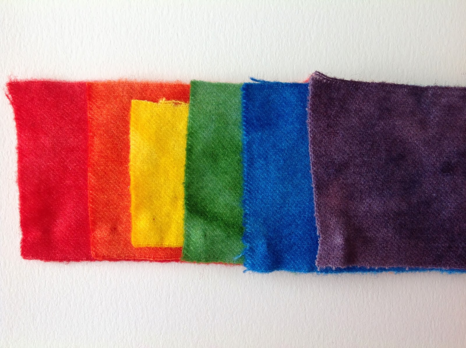
They look a lot brighter and truer to color in real life.
We then did some toning of colors using the colors complement. Here we have the mixing of Prochem 808 (raspberry), a red-violet with Prochem 719 (grasshopper), a yellow-green. This is the grouping on the bottom row. In mixing various amounts one gets a beautiful array of complex colors.
The top row is a combination of 228 (saffron), a yellow-orange and 401 (colonial blue), a blue-violet.

We then just did some playing to make some beautiful things...


Tuesday, October 29, 2013
For the birds
I enjoyed hooking theTitmouse so much I decided to try another bird.
This time I went with a chickadee. It has been so cold here the last week I decided to put him on a snow covered branch.
I fussed and fussed with the eye. It is so small I was hooking in threads of wool so as not to make it too big.
I like doing the backgrounds in spot dyes, hooking them in order as they come through the cutter. It is more tedious but I like the blurred watercolor wash effect it gives.
Enjoy the day. Thanks for reading.
 | |||||||||
| Titmouse |
 | |
| Chickadee |
I like doing the backgrounds in spot dyes, hooking them in order as they come through the cutter. It is more tedious but I like the blurred watercolor wash effect it gives.
Enjoy the day. Thanks for reading.
Sunday, October 27, 2013
Sanford Quilt Show Report
Last weekend I was a vendor at the Hearts and hands quilt guild in Sanford, NC. There were beautiful quilts to see as well as a good group of vendors. I met a lot of new folks and caught up with some old friends. I did a good amount of wool and kit sales and got a rather lengthy list of people interested in rug hooking lessons. It was exciting, fun, exhausting and fabulous. It took me several days to pack and several days to unpack.
 |
| my booth at the Sanford quilt show |
Friday, October 11, 2013
Finished.
I finally finished up my Beltie piece, with the exception of some minor tweaks and framing. I haven't had a lot of time for hooking as I have been dyeing wool like a mad woman. I will be a vendor at the Hearts and Hands Quilt Show this next week. Stop on by if you're in the area. I'm sure there will be a lot of really great quilts and great vendors.
For now, here's the Beltie.

For now, here's the Beltie.

Friday, September 27, 2013
More progress on the beltie and another little piece...
Here I am playing catch up again. I was out of town playing hookie (literally) with my friends. I managed to get more done on the Beltie and to mix it up I hooked a small bird piece, a Titmouse to be precise.
Here's the Beltie... Getting closer to done than undone.

And here's the Titmouse...

Thanks for reading...
Here's the Beltie... Getting closer to done than undone.

And here's the Titmouse...

Thanks for reading...
Thursday, September 5, 2013
Reminiscing
I was asked recently by my mother-in-law to attach a sleeve to a rug I had hooked for her back in 1997. She has recently moved and has no place in the new house to place the rug on the floor. She does however have an expansive wall in the living room and she had nothing large enough to fill it. Last week I put a sleeve on the back and yesterday we got it hung. I realized I never did get a picture of it way back when I hooked it so I took one.
 When I began rug hooking (back in the late 70's) this was typical of the types of rugs people were hooking. Finely shaded flowers and scrolls were the norm and not too many people did original works. This is a pattern designed by Jane McGown Flynn called Palace Scroll. When my mother-in-law asked for the rug I was hoping she just wanted something small and/or wide cut. No dice. She wanted "a rug large enough to put in the guest bedroom in front of the dresser and with shaded flowers and scrolls." This rug measures approximately 3" x 5' and is done with 3/32" strips. It took me a good 6 months to complete. The nice thing, she thoroughly enjoys it and appreciates the amount of time and effort that was put into it.
Though I do love these types of designs, I enjoy doing animals much more and that's where I am some 30+ years later.
Thanks for reading...

Though I do love these types of designs, I enjoy doing animals much more and that's where I am some 30+ years later.
Thanks for reading...
Subscribe to:
Posts (Atom)