A week ago I taught a color class. I did a thorough walk through of the Color Wheel Company's color wheel. Have you ever read ALL the information it contains? It is a whole lot of good stuff packed into one handy little tool. Every artist, no matter their medium, needs to have a color wheel! We discussed primary, secondary and tertiary colors as well as tint, tone and shade. Also discussed were color harmonies and value. After my students had been totally overwhelmed I sent them home to absorb and rest.
 |
| Color Wheel Company colorwheel |
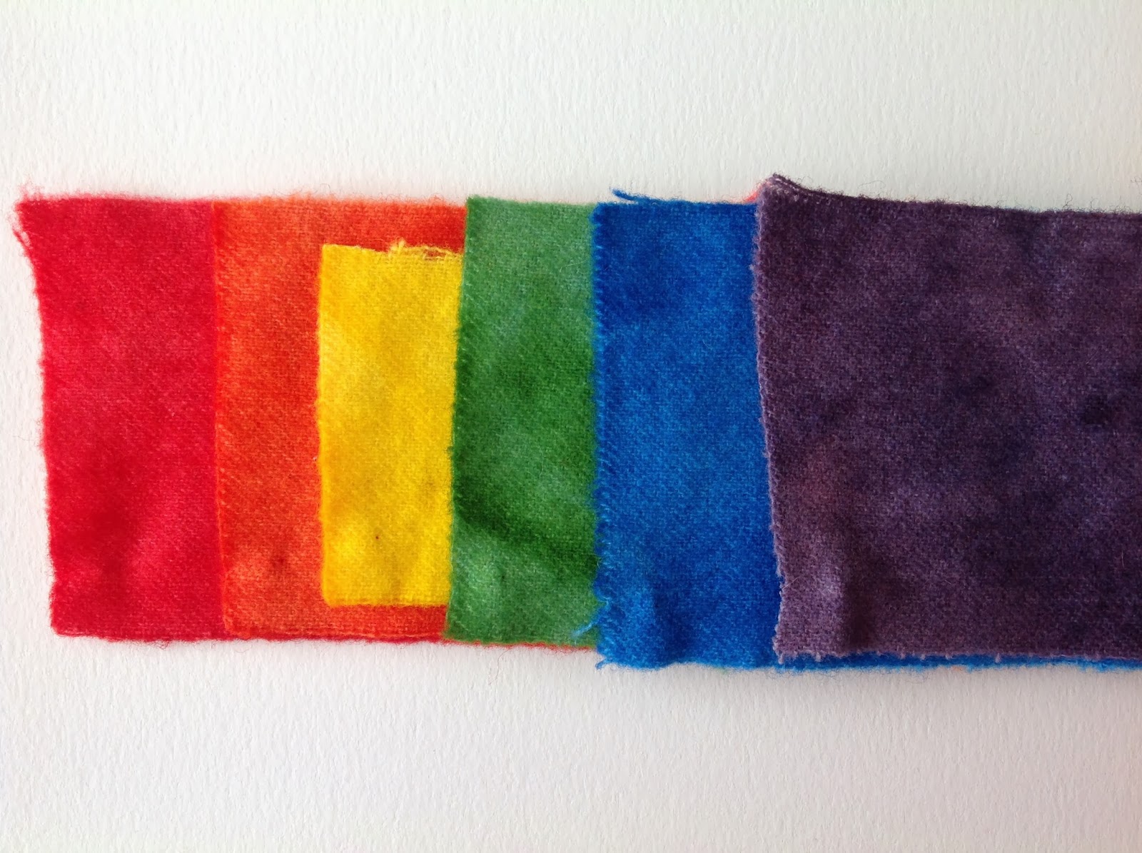
Yesterday I did a follow on class. Using what we learned the previous week and applying it in the dye pot. First we did a simple color wheel, primary and secondary colors only. In doing this we had to decide what primaries we would use. Because we were trying to imitate the Color Wheel Company's color wheel we chose Prochem 351 (bright red), Prochem 119 (sun yellow) and Prochem 490 (brilliant blue). We then had to decide what amounts of yellow to add to red to make orange. It ended up being a 4:1 ratio of yellow to red. With the green we used a 4:1 ratio as well, yellow to blue. For the violet we did a 1:1 ratio. The only secondary that I felt was not quite right was the orange. It needs a tad more yellow. It leans towards the red-orange side. Here's our results in a photo.
They look a lot brighter and truer to color in real life.
We then did some toning of colors using the colors complement. Here we have the mixing of Prochem 808 (raspberry), a red-violet with Prochem 719 (grasshopper), a yellow-green. This is the grouping on the bottom row. In mixing various amounts one gets a beautiful array of complex colors.
The top row is a combination of 228 (saffron), a yellow-orange and 401 (colonial blue), a blue-violet.
We then just did some playing to make some beautiful things...